Production possibility curve (PPC) diagrams Exam Questions
31 past-paper questions on this unit. Five of them are below. Answer on the page: each one is marked the moment you pick, the correct option is shown whether or not you found it, and the full explanation opens either way.
Cambridge IGCSEPaper 1 MCQsFree account
Production possibility curve (PPC) diagrams: five questions to try now
Real past-paper questions, the answer key from the mark scheme, and the explanation that goes with it. No account needed to answer them.
Question 1
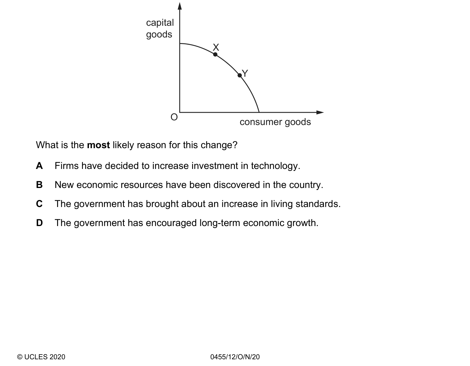
The diagram shows a production possibility curve (PPC) for a country. The country moved from position X to position Y on the PPC. What is the most likely reason for this change?
Answer: C.
X and Y are both on the curve, so this is a movement ALONG the frontier and not a change in what the economy is capable of producing. Y lies further towards consumer goods and lower on capital goods, so the country has chosen to produce more for consumption now and less for future production, and the natural reason for a government to do that is to raise living standards today. A, B and D all describe changes that would SHIFT the curve outwards rather than move along it: investment in technology raises productivity, newly discovered resources add to the factors available, and long-term growth policy is aimed at capacity itself. There is a further reason D is wrong: giving up capital goods reduces the economy's future productive capacity, so the move shown is the opposite of a push for long-term growth.
Question 2
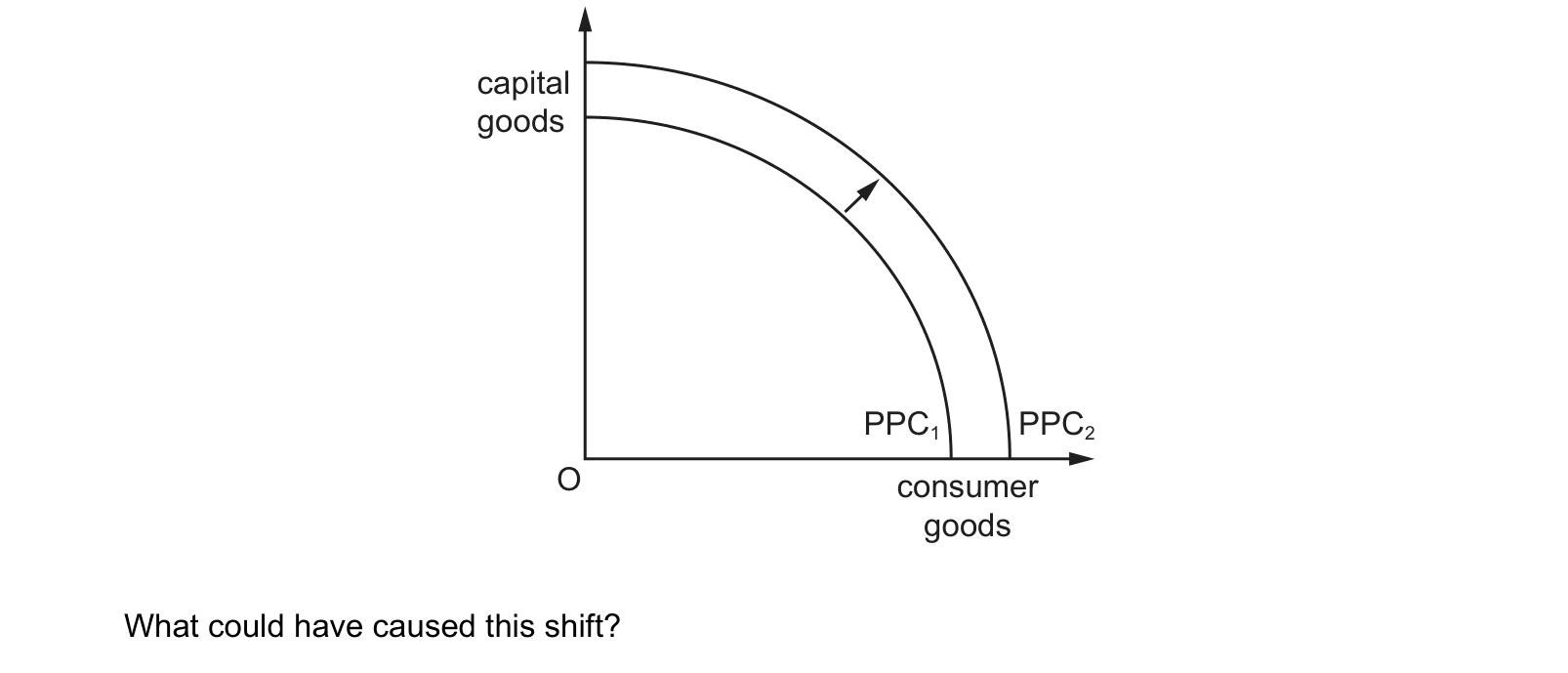
The production possibility curve of a country has shifted from PPC to PPC . 1 2 capital goods PPC PPC 1 2 O consumer goods What could have caused this shift?
Answer: C.
The whole curve moves outwards from PPC1 to PPC2, so the economy can produce more capital goods and more consumer goods than before, and only a rise in the quantity or the quality of resources can do that. Improved education raises the quality of labour, so the same number of workers can produce more, which lifts the entire frontier. A does not move the curve, because falling unemployment brings idle resources into use and shifts the economy from a point inside the frontier onto it. B and D both push the other way: a falling birth rate means a smaller future workforce, and technology left unreplaced means capital that gradually becomes less productive, so each would move the curve inwards over time rather than outwards.
Question 3
The diagram shows an economy’s production possibility curve (PPC). The economy moves from point X to point Y. What is the most likely effect of this change?
Answer: A.
X and Y are both points on the SAME curve, so the economy is using all its resources before the change and all of them after it, and the only thing that differs is the combination produced. Y lies further towards consumer goods and lower on capital goods than X, so different quantities of the two goods are produced and nothing more can be concluded. B is wrong because full employment applies at every point on the frontier, so moving between two of them does not put anyone new into work. C is wrong because the economy stays on its frontier and so continues to produce the maximum it can, which is why total output does not fall. D is the opposite of what the diagram shows, since the move is towards consumer goods and away from capital goods, and investment is the production of capital goods.
Question 4
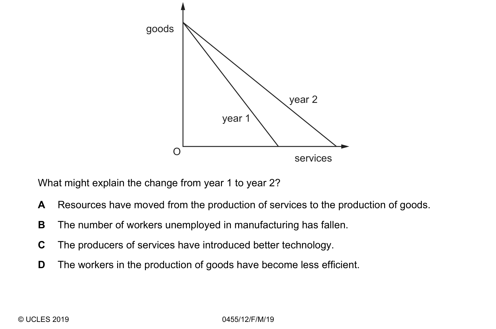
The diagram shows the change in an economy’s production possibility curve (PPC) from year 1 to year 2. What might explain the change from year 1 to year 2?
Answer: C.
Read the diagram before reading the options: the goods intercept on the vertical axis is unchanged between year 1 and year 2, while the services intercept on the horizontal axis has moved outwards, so the curve has PIVOTED rather than shifted as a whole. That means capacity has risen in services alone, and better technology in service production is precisely a change that raises what services can produce while leaving goods production untouched. A describes moving resources between the two, which is a movement ALONG a curve and cannot change where either intercept lies. B would move the economy from a point inside the curve onto it, since employing idle workers uses existing capacity rather than creating more. D would pull the GOODS intercept inwards, which is not what the diagram shows.
Question 5
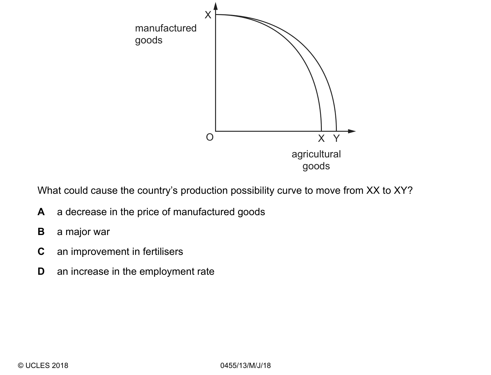
The diagram shows a country’s original production possibility curve XX. What could cause the country’s production possibility curve to move from XX to XY?
Answer: C.
The curve moves from XX to XY, and the shape of that move settles the answer: the manufactured goods intercept at X is unchanged while the agricultural goods intercept moves out from X to Y, so the curve has pivoted and only farming capacity has grown. Better fertilisers raise the yield of the same land and labour, which is exactly a rise in agricultural capacity with no effect on manufacturing. B would move the whole curve INWARDS, since a war destroys resources rather than creating them. D would move the economy from a point inside the curve onto the curve, because employing more of the existing workforce uses spare capacity rather than adding to it. A changes the relative prices of the two goods, which affects which point on the curve is chosen and not where the curve itself lies.
These questions are drawn from past Cambridge IGCSE papers and filtered to production possibility curve (ppc) diagrams. You answer, you find out immediately whether you were right, and you get the reasoning for the correct option and for each distractor. Wrong answers go to a mistakes locker so you can come back to exactly those.
Practice is free. You need an account only so your progress and your mistakes are still there next time.
These are the errors that cost marks on production possibility curve (ppc) diagrams, taken from our own topic notes. Read them before you practise and you will recognise the traps in the questions.
Calling a point outside the curve "inefficient" instead of unattainable.
Shifting the curve outward to show a recovery from unemployment. That is a movement towards the curve.
Moving along the curve to show economic growth. Growth is a shift.
Shifting the whole curve when only one good is affected.
Forgetting to label the axes with the two goods.
Saying a bowed-out curve shows constant opportunity cost.