Production possibility curve (PPC) diagrams
Contents: 13 sections
What a PPC shows
A production possibility curve shows the maximum combinations of two goods an economy can produce when all its resources are fully and efficiently used, with current technology.
It is a diagram of the economic problem: because resources are limited, producing more of one good means producing less of the other.
Drawing it: put one good on each axis, name them both, and draw the curve from one axis to the other.
Reading points on the diagram
This is the most-tested part of the topic, and the wording matters.
| Position | Meaning |
|---|---|
| On the curve | Efficient: all resources fully employed |
| Inside the curve | Inefficient: some resources unemployed or wasted |
| Outside the curve | Unattainable: not possible with current resources |
A point outside the curve is not "inefficient". It is impossible. Calling it inefficient is one of the most common errors in the whole unit.
Opportunity cost on the PPC
Moving along the curve shows opportunity cost directly: to get more of one good you must give up some of the other.
Moving from point A to point B: the economy gains 20 units of food but gives up 15 units of clothing → the opportunity cost of 20 food is 15 clothing.
Because the movement is along the curve, resources are being reallocated, not created.
The shape tells you about opportunity cost:
- A curved (bowed-out) PPC means opportunity cost increases. Resources are not equally suited to both goods, so as you make more of one, you give up more and more of the other.
- A straight-line PPC means opportunity cost is constant, resources are equally good at producing both.
Unemployment on the PPC
A point inside the curve shows the economy is not using all its resources, there is unemployment or waste.
Moving from inside the curve to the curve raises output of both goods with no opportunity cost, because idle resources are being brought into use. That is a recovery, not growth.
Economic growth on the PPC

Economic growth is shown by the whole curve shifting outward. The economy can now produce more of both goods.
Causes of an outward shift:
- more resources, a larger workforce, new land or discoveries
- better resources, education and training, better technology
- more capital from investment
An inward shift shows the opposite: a fall in productive capacity, from war, natural disaster, disease, or a large fall in the workforce.
A shift on one axis only happens when an improvement affects just one good. If a new farming technology improves food production only, the food intercept moves out and the clothing intercept stays where it is, the curve pivots rather than shifting.
The growth trade-off
Draw the PPC with capital goods on one axis and consumer goods on the other, and it shows something important:
Choosing more capital goods now means fewer consumer goods now, but capital goods produce future output, so the curve shifts further out later.
That is the trade-off between living well today and growing faster tomorrow.
Worked example
An economy produces only wheat and machinery, and is currently at a point inside its PPC with high unemployment.
- Resources are idle
- moving to the curve raises output of both goods
- so this improvement has no opportunity cost
- this is a recovery, not growth, and the curve does not move.
Now the economy is on the curve and wants more machinery.
- It must move along the curve
- wheat output falls
- the opportunity cost of the extra machinery is the wheat given up.
Finally, the government invests in new technology.
- Productive capacity rises
- the whole curve shifts outward
- the economy can now produce more of both goods
- this is economic growth.
Those three cases, inside to on, along, and outward shift, are the three things this topic tests.
Common exam mistakes
- Calling a point outside the curve "inefficient" instead of unattainable.
- Shifting the curve outward to show a recovery from unemployment. That is a movement towards the curve.
- Moving along the curve to show economic growth. Growth is a shift.
- Shifting the whole curve when only one good is affected.
- Forgetting to label the axes with the two goods.
- Saying a bowed-out curve shows constant opportunity cost.
Exam technique
Label both axes with the names of the goods, not "X" and "Y". Mark points clearly with letters and use dotted lines to the axes so the examiner can see the quantities you mean.
Decide first what the question describes:
- Using idle resources
- move towards the curve
- Reallocating resources
- move along the curve
- More or better resources
- shift the curve
Getting that choice right is worth more than a neat drawing, because it shows you understand what the diagram represents.
Building an answer
4 marks, "Explain what a point inside the production possibility curve shows."
A point inside the curve shows the economy is not using all its resources fully or efficiently, there is unemployment or under-use of capital.
Because there is slack, output of one good can be increased without reducing the other, so there is no opportunity cost of moving towards the curve. That is what makes the position inefficient.
6 marks, "Analyse two causes of an outward shift of the production possibility curve."
The first is an increase in the quantity of resources: a growing workforce through population growth or migration, or the discovery of new natural reserves. More resources means more can be produced of both goods.
The second is an improvement in the quality of resources: better technology or better-trained workers raise output per unit of input, so the same resources produce more.
Either way the whole curve moves outward, which represents an increase in the economy's productive potential, economic growth in the long-run sense, as opposed to simply using existing capacity more fully.
That last distinction, potential growth against actual growth, is what separates a 6-mark answer from a 4-mark one.
Reading any PPC question
| What you see | What it means |
|---|---|
| Point on the curve | Efficient: all resources fully and efficiently used |
| Point inside the curve | Inefficient: unemployment or under-use of resources |
| Point outside the curve | Currently unattainable with existing resources and technology |
| Movement along the curve | Reallocating resources; one good rises only as the other falls |
| Outward shift | More or better resources: productive potential has grown |
| Inward shift | Resources lost: war, natural disaster, emigration |
| Curve bowed outward | Increasing opportunity cost, because resources are not equally suited to both uses |
A real case to quote
Ukraine after 2022. Destroyed infrastructure, lost territory and millions of people displaced abroad reduced both the quantity and quality of available resources, shifting the production possibility curve inward. It is a stark illustration that a PPC is not only a diagram about growth, it moves in both directions.
Quick revision
- PPC = maximum combinations of two goods with current resources.
- On the curve = efficient. Inside = inefficient. Outside = unattainable.
- Movement along = opportunity cost; resources reallocated.
- Movement from inside to the curve = recovery, no opportunity cost.
- Outward shift = economic growth; inward shift = falling capacity.
- Bowed-out curve = increasing opportunity cost; straight line = constant.
- More capital goods today → bigger outward shift tomorrow.
Check you have it
Question 1
The diagram shows a production possibility curve (PPC) for an economy.
W Z
X
Which change on the diagram could represent an increase in unemployment?
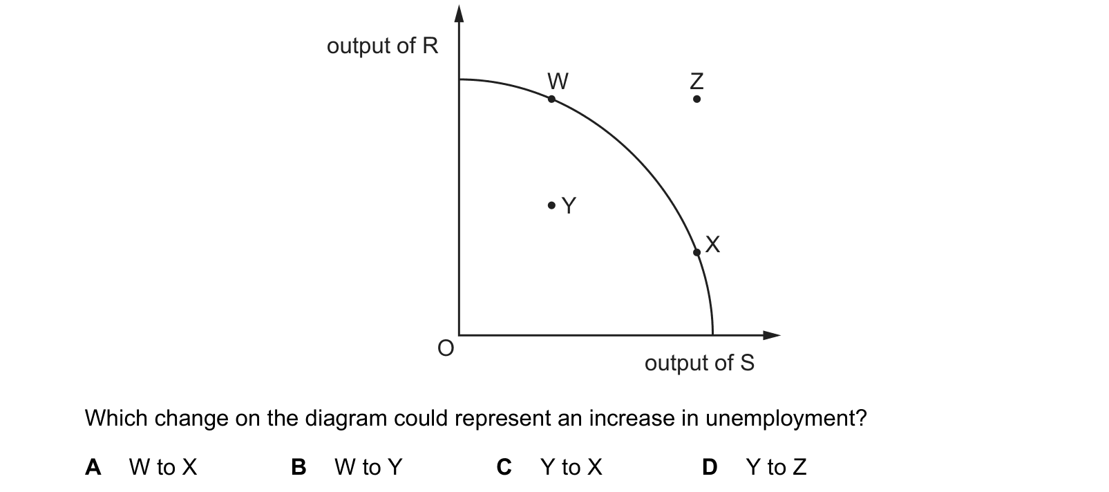
Answer: B.
Question 2
The diagram shows a production possibility curve (PPC). Which of these points shows the largest possible output of product Y currently achievable?

Answer: B.
The word doing the work in this question is currently achievable. Any point on or inside the production possibility curve can be reached with the resources and technology the economy has now; any point beyond the curve cannot. Among the points that can be reached, the one giving the greatest output of product Y is the one placed highest up the vertical axis, and that is B, which sits on the curve itself.
Why the other options are wrong:
- A is higher up the diagram than B and so shows more of product Y, but it lies outside the curve. It is unattainable with current resources, so it cannot be the largest achievable output however tempting the position looks.
- C lies on the curve but much further to the right, where resources have been switched into product X. Its output of product Y is well below that at B.
- D lies inside the curve. Resources are unemployed or being used inefficiently, so the economy could produce more of product Y without giving up any product X at all.
Question 3
Countries X and Y have identical resources. The diagram shows their production possibility
curves.
What can be concluded from the diagram?
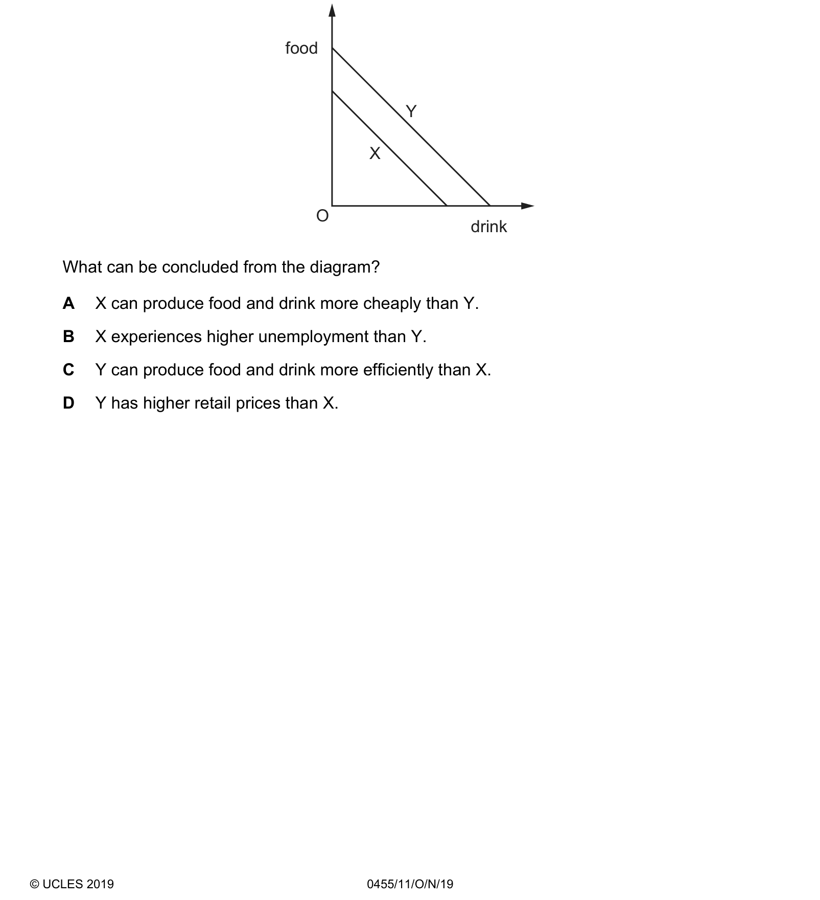
Answer: C.
What the syllabus asks for on this topicSyllabus points
Syllabus points
- Define a production possibility curve (PPC).
- Interpret points on, inside and outside the curve.
- Use the PPC to show opportunity cost, unemployment and economic growth.
Related Cambridge IGCSE topics
Not the topic you were looking for? Describe what you are stuck on in your own words and we will take you to the notes that answer it.