Types of Trade Protection
Contents: 8 sections
IB Economics · Unit 4 The Global Economy · syllabus 4.2
The instruments governments use to restrict trade, and how to analyse each on a diagram. The tariff diagram is the one that appears most often and carries the most marks.
Key definitions
| Term | Exam-ready definition |
|---|---|
| Tariff | A tax on imported goods. |
| Quota | A physical limit on the quantity of a good that may be imported. |
| Production subsidy | A payment to domestic producers that lowers their costs and shifts domestic supply right. |
| World price | The price at which a small country can buy or sell unlimited quantities on the world market. |
| Welfare loss | The loss of consumer and producer surplus that is not transferred to anyone, shown as the two triangles on a tariff diagram. |
Types of trade protection
| Type | What it is | Effect |
|---|---|---|
| Tariff | A tax on imports | Raises import prices; generates government revenue |
| Quota | A quantitative limit on imports | Raises price; the gain goes to importers, not government |
| Subsidy to domestic producers | Payment lowering domestic costs | Domestic supply rises; costs the taxpayer |
| Administrative barriers | Standards, licensing, paperwork | Raise costs, hard to challenge as protectionist |
| Embargo | A total ban | Eliminates trade in that good |
Tariff versus quota is a standard comparison. Both raise the domestic price and cut imports. The difference is where the money goes: a tariff transfers it to the government as revenue, while a quota hands it to whoever holds the import licence as extra profit, often foreign exporters. That makes a quota worse for the importing country at the same level of protection, unless the licences are auctioned.
Analysing a tariff
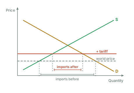
The tariff diagram is the technical core of this topic. Build it in order:
- Draw domestic demand (D) and domestic supply (S).
- Add the world price as a horizontal line below domestic equilibrium, the country is a price taker at this price.
- At the world price, domestic supply is small and domestic demand is large; the gap is imports.
- Impose the tariff: the horizontal line shifts up by the tariff amount.
Reading off the consequences at the higher price:
- Domestic production rises (movement along S), protected firms produce more.
- Domestic consumption falls (movement along D).
- Imports fall by both amounts combined.
- Government revenue = tariff × the new quantity of imports (a rectangle).
- Consumer surplus falls; producer surplus rises.
- Two welfare loss triangles remain: a production inefficiency (domestic firms producing at higher cost than foreign firms) and a consumption inefficiency (consumers priced out of purchases worth more to them than the world price).
The net effect on society is negative: consumers lose more than producers and government together gain.
Working the areas
The world price of steel is \$200 a tonne. A \$50 tariff raises it to \$250. Domestic supply rises from 100 to 200 tonnes; domestic demand falls from 500 to 400.
Imports fall from 500 − 100 = 400 to 400 − 200 = 200 tonnes.
Government revenue = \$50 × 200 = \$10,000
Producer surplus gain = ½ × (100 + 200) × \$50 = \$7,500
Production welfare loss = ½ × \$50 × (200 − 100) = \$2,500
Consumption welfare loss = ½ × \$50 × (500 − 400) = \$2,500
Consumer surplus loss = \$50 × ½ × (500 + 400) = \$22,500
Check the areas balance, which is what proves the diagram was read correctly:
Consumer loss \$22,500 = producer gain \$7,500 + government revenue \$10,000 + welfare loss \$5,000 ✓
Consumers lose \$22,500; only \$17,500 of that reappears anywhere. \$5,000 is simply destroyed, the two triangles, and that is the net cost of the tariff to the country imposing it.
Why the world supply curve is horizontal
This assumption is drawn without comment in most answers and is worth one sentence of justification, because it is what makes the diagram work.
A single small country is one buyer among many on the world market, so its own demand does not move the world price. It can therefore buy as much as it wants at that price, which is a perfectly elastic supply from the rest of the world, drawn as a horizontal line. If the country were large enough for its purchases to move the world price, the line would slope and a tariff would push some of the burden onto foreign exporters. That is the assumption behind the optimal tariff argument, and noting it is a genuine evaluative point.
Comparing the three main instruments
At the same level of protection, tariffs, quotas and subsidies produce the same domestic price rise for producers but distribute the cost very differently, which is the comparison examiners want.
| Consumers pay more | Government gains revenue | Domestic output rises | Where the transfer goes | |
|---|---|---|---|---|
| Tariff | Yes | Yes | Yes | Government |
| Quota | Yes | No | Yes | Whoever holds the import licence, often the foreign exporter |
| Production subsidy | No | No, it costs the taxpayer | Yes | Domestic producers, funded by taxpayers |
The subsidy is the instrument that protects producers without raising the consumer price, which is why it is the standard alternative to offer when evaluating a tariff. Its cost is borne by taxpayers rather than by consumers of that good, which changes who loses rather than removing the loss.
Real-world examples
- The European Union's tariff-rate quotas on agricultural imports allow a set quantity in at a low tariff and apply a much higher rate above it, which is a hybrid of the two instruments and a useful example of why the categories blur in practice.
- Japan's rice market was long protected by quota and remains protected by very high tariffs, and the usual figure quoted is a domestic price several times the world price, which makes the consumer cost of protection concrete.
- Administrative barriers are the hardest to challenge precisely because they can be justified on other grounds. Differing safety, labelling and inspection requirements raise the cost of exporting without ever being called protection.
Exam technique
- Draw the world price line first, then the tariff line above it. Building the diagram in that order stops the common error of shifting the domestic supply curve.
- Label the four consequences separately: the fall in imports, the rise in domestic production, the fall in consumption, and the government revenue rectangle.
- When comparing a tariff with a quota, lead with where the money goes. That is the distinction, not the size of the price rise.
- If the question mentions a large economy, say that the horizontal world supply assumption no longer holds and that some of the tariff burden falls abroad.
Common exam mistakes
- Confusing a quota (a quantity limit) with a tariff (a tax), and so mislabelling who receives the revenue. A tariff raises government revenue; a quota transfers that area to whoever holds the import licence.
- Omitting the two welfare-loss triangles when analysing a tariff, which is where the efficiency argument lives.
- Treating a subsidy to domestic producers as a tariff. It lowers domestic cost rather than raising import price, so the domestic price is unchanged and consumers are not directly harmed.
- Forgetting administrative barriers and voluntary export restraints, which are on the syllabus and are the forms most used in practice.
Quick revision
- Tariff: a tax on imports. Domestic price rises, domestic output rises, imports fall, government gains revenue, two deadweight triangles appear.
- Quota: a quantity limit. Similar price effect, but the revenue area accrues to licence holders rather than the government.
- Subsidy to domestic producers: shifts domestic supply right, no rise in domestic price, cost borne by the taxpayer.
- Administrative barriers and standards restrict trade without any visible tax.
Check you have it
Cross-board concept practice · originally a CIE 9708 question, used here because the concept is the same. It is not IB Economics past-paper material.
Question 1
The following are four conditions sometimes attached to IMF loans to developing countries. Which condition would conflict with the ‘infant industry’ argument?
Answer: A.
Explanation:
The infant industry argument is an economic rationale for protectionist trade policies to shield developing industries from international competition so they can grow and become competitive in the future. This argument suggests that without protection, these industries could be driven out of the market by more established competitors.
If a country is following the infant industry argument, it would typically want to impose trade barriers like tariffs or quotas to protect its domestic industries. Free trade, on the other hand, advocates for the removal of such barriers to promote international trade and specialisation in production, which could potentially put the infant industries at a disadvantage due to increased competition.
Therefore, the condition the need to allow free trade goes against the concept of protecting infant industries and promoting their growth, making it incompatible with the infant industry argument and potentially conflicting with the objectives of developing countries seeking to protect their domestic industries through trade restrictions.
Cross-board concept practice · originally a CIE 9708 question, used here because the concept is the same. It is not IB Economics past-paper material.
Question 2
The following are four conditions sometimes attached to IMF loans to low-income countries.
Which condition would conflict with the ‘infant industry’ argument?
Answer: A.
The infant industry argument holds that a newly established domestic industry cannot yet compete with established foreign producers, because it has not reached the scale at which unit costs fall or accumulated experience. Temporary protection, a tariff or quota, is said to shelter it until it can compete unaided. A loan condition requiring free trade removes exactly that protection, exposing the infant industry to full foreign competition before it has matured. The two positions are in direct conflict.
Why the other options are wrong:
- B, controlling inflation, is compatible with protecting a young industry, and low inflation actually helps competitiveness. It concerns the price level, not trade barriers.
- C, contractionary fiscal policy, reduces government spending or raises taxes. It may squeeze demand generally and could reduce subsidies, but it does not address whether imports face barriers.
- D, privatisation, changes who owns firms. A privately owned infant industry can still be protected by tariffs, so ownership and protection are separate questions.
Cross-board concept practice · originally a CIE 9708 question, used here because the concept is the same. It is not IB Economics past-paper material.
Question 3
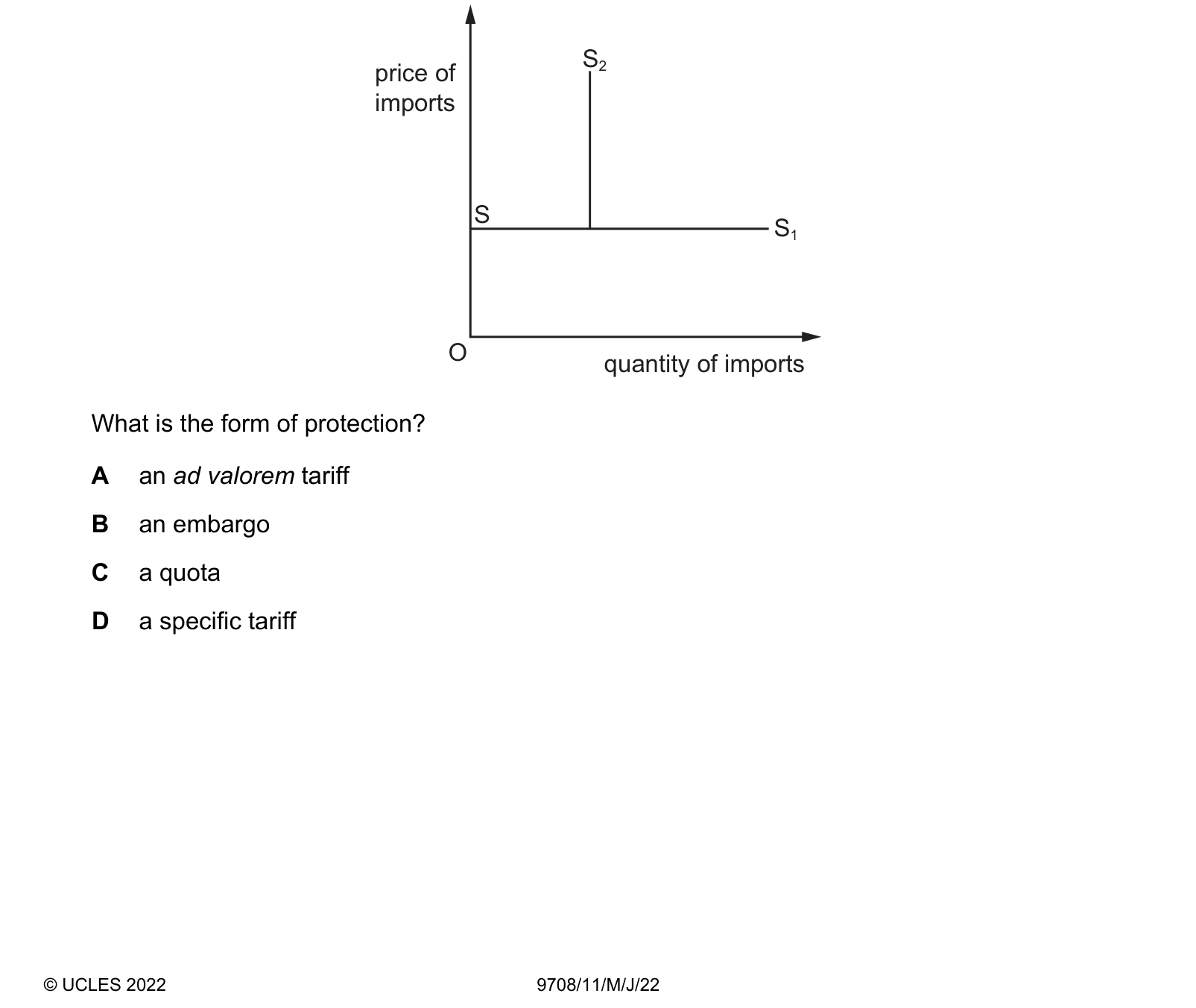
The diagram shows the change in the supply curve of imports, S–S1 to curve S–S2, after the introduction by the government of a trade protection measure. price of imports O quantity of imports S S1 S2 What is the form of protection?
Answer: C.
What the syllabus asks for on this topicSyllabus points
Syllabus points
- Tariffs, quotas, subsidies, administrative barriers and embargoes.
- Diagram analysis of a tariff, and of a quota and a production subsidy.
- The effects on consumers, producers, government and the rest of the world.
- (HL) Calculating the welfare areas on a tariff diagram.
Related IB Economics topics
Not the topic you were looking for? Describe what you are stuck on in your own words and we will take you to the notes that answer it.